Project 3
What do I believe drawing to be?
I had never thought of drawing as anything other than pen or
pencil on paper before I started my degree journey. My eyes have definitely been
opened to the endless possibilities of medium and tools that can be used and to
forever push the boundaries of convention. I am sat here thinking of all the
different ways you can create a mark, which is essentially to draw. It could be
chalk on a blackboard or even water painted on the dry pavement to be there for
just a few moments to then vanish. Or the pictures the children draw on a
steamed up window which I often tell them off for but it is a form of drawing
and often cheers me up when it re-steams up on the way to work and I see their
artwork travelling with me. I believe a
drawing to be defined as a mark left on the any surface, with any medium with
any tool.
Drawing has many purposes, to draw a diagram of a plan for a
building, capture a beautiful scene, make patterns, or to just experiment and
have fun with. There is no form or unformal rules drawing is what you want to
make of it and what purpose you have for it.
I believe that a camera captures a memory, but I do not see
how you can draw with a camera. The definition of drawing online states the
following:
a picture or diagram made with a pencil, pen, or crayon
rather than paint.
This only helps to support my argument that it is the action
of creating the mark that defines drawing.
Exercise 1.7 Sources and media
I think I spent more time debating which flowers to use, I’d
purchased 2 bunches. 1 just because they had a good section of flowers to
choose from. The second was a punch of dark roses that I thought were very in
keeping with the Halloween season. What I really wanted to use was sunflowers, I
love sunflowers and I have worked with them before. Unfortunately, they are now
out of season so I would have to work from my artificial ones. This wasn’t
quite the same as drawing from a real flower with its natural marks, colours
and imperfections that made them interesting. So this left me with the 2 real
bunches to decide between.
I spent far to long analysing the flowers and working out which would be the easiest to capture, which would be the most interesting, and which media I could use to capture each of them. I finally decided to come out of my comfort zone and picked the bouquet with a mixture of flowers, colours and foliage.


To begin with I did a basic sketch of the bouquet using a
fineliner. I wanted to use this sketching time to help me analysis and get to
know the flowers. I wanted to see the which parts of the bouquet appealed to me
the most. There were flowers and leaves that were of more interest to me than others.
This led onto my second sketch using one of the techniques I had used in my
previous assignments continuous line drawing. These helped me to look at a
selection of flowers in more detail looking at the different shapes and lines that
make up the flower.


The next set of pieces I wanted to focus more on the shape
of the flowers and leaves. One of the features I had noticed of all the artists I
had researched was how they focused on the flowers as a simplest form. Removing
the detail from the images and focusing on the basic form. Working with this in
mind I wanted to create a template and do a selection of prints. Using the
cardboard template as a stamp wasn’t very effective as it left the marks of the
corrugated cardboard in the in the paint. What did work well using my gelli
plate and leaving a silhouette of the templates. Using the plate to create a
repetitive pattern. I then developed this technique using the gelli plate and
used it to scratch out the leaf and the flower I had been focusing on the basic
outline and now moved onto adding more detail. I felt out of the two techniques
I felt the template had the most striking effect. The detail had been lost in
the scratched print.


I carried on experimenting with the theme of basic forms,
this time I used masking fluid to trace out the flowers out. Using coloured
paper to give the image colour.


Now I had a taste for colour I wanted to try a more
traditional use of colour. I begin by sketching the leaf of the chrysanthemum.
I decided to use oil pastels, these are not my preferred form of medium, but I
wanted a medium that would give me the bright vivid colours like the colours Takashi
Murakami uses in his work. Using a white paper as background to make the colour
pop even more.

I then went for a more delicate use of colour using water
colour pens, although I chose one of the bright gerberas from the bouquet to
use. Using delicate brush strokes to capture the petals.

As I had enjoyed working with unconventional tools in the
previous exercises. I wanted to use the item I was sketching to make the sketch.
Using one of the leaves holding and bending it into different angles to create different
strokes of paint. I chose to use a larger sheet of paper for this piece
allowing me more area to work over. I think this is one of my favourite pieces
in the collection, I love how expressive it felt creating the piece and using the
natural edges of the leaf to make the flowers. The angles of the strokes also give
the flowers depth, and you get the feel of the layers of petals on each flower head.


The final area I wanted to look at after looking at Hockney’s
work was using the iPad to draw. This was a path I was loathed to take as one
of the key parts to art and being creative I enjoy is the mindfulness and
becoming lost in the piece I am creating. Spending a lot of time on technology
at work I enjoy that downside from it. I gave it a go and found it very
difficult to use and missed having a tool in my hand and a medium to work with
onto a surface.

I have enjoyed coming away from the repetitiveness of the archive
items and using a new source for my work. I have also welcomed colour into my
work and found this interesting extending it into my work. I look forward to
bringing the many techniques I have developed within this unit into future
work.
Research Point 2
I went through the list of artists and the first one who
jumped out of me mainly because it was the only one I was familiar with from
the list was William Morris. I have always loved his fabrics the elegance of
his patterns. With flowers, leaves and sometimes animals used to make a repetitive
pattern. The pieces held so much detail, with every inch being covered with the
flowers and leaves. His work is so iconic and easily recognisable. The patterns
are so versatile being using for textiles, wallpapers and prints.
I wanted to know how William Morris produced his wallpapers.
I found out that printed by hand, using carved, pear woodblocks loaded with
natural, mineral-based dyes, and pressed down with the aid of a foot-operated
weight. I loved the hands-on approach he used with his work the traditional methods,
this is the way I enjoy working this is why I fell I am drawn to his work.
This reminded me of Wabi Sabi and how imperfections beautiful
and should be appreciated.
His work helped to inspire me within this exercise using a repetitive, I have enjoyed the printing element to this exercise. I would like to develop this further in future projects and work more detail into prints.

https://www.theartstory.org/artist/morris-william/artworks/
Tord Boontje
Tord Boontje is originally from the Netherlands and his
education at the Eindhoven Design Academy and the Royal College of Art in
London set the foundations for Studio Tord Boontje.
Tords earlier work ‘Rough and Ready Furniture was made from
recycled old wood giving the furniture a very organic feel.

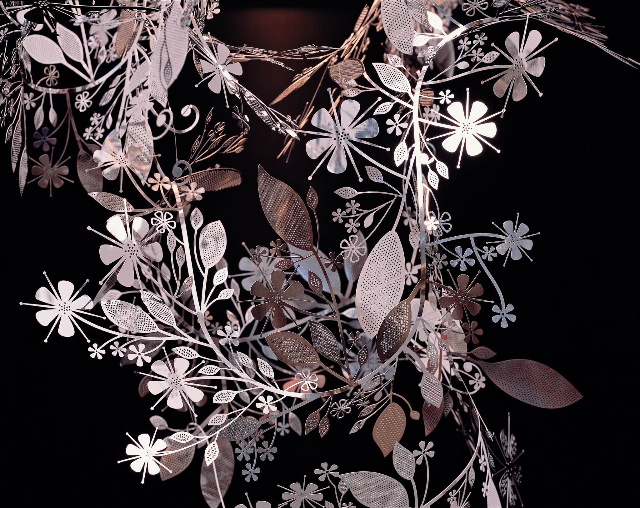
The pieces that drew me to Tords work was his garland lamp
shades, they embodied the whimsical, playful look I had been drawn to. There
are so many intricate details cut out of metal, with small holes cut out of the
leaves and flowers. With the garland hanging over a light I can imagine the
beautiful shadows that would be projected onto the wall.
Takashi Murakami
This Japanese artist is not something I would usually pick
to look at. His work is somewhat childlike and reminded me of some of the kawii
drawing my daughters do. He uses bright cartoon like flowers, recreating them
in a repetitive pattern.
They are very flat images that hold no detail, he is s known
for his contemporary pop blend of fine art and popular culture. Takashi’s work
includes paintings, sculptures, drawings, animations, and collaborations with
brands such as Louis Vuitton.
Each of his creations begins as a sketch, scanned images are
‘painted’ using Adobe Illustrator and then the final versions printed onto
paper, canvas etc. and then painted by staff on the factory lines.


What I remember of Hockney from when I was at collage and studying pop art culture was that he was a big part of the pop art movement of the 1960s. He produced bright, bold and colourful images such as his piece A Big Splash which is oil on canvas.

I was surprised at the different styles of flowers Hockney
produced over his career starting with his early work White Porcelain which to
me looked like a basic sketch but is described as lithograph, I was not familiar
with what that was so l did some research.
Lithography is a printing process that uses a flat stone or
metal plate on which the image areas are worked using a greasy substance so
that the ink will adhere to them by, while the non-image areas are made
ink-repellent


https://thedavidhockneyfoundation.org/chronology/1997

No comments:
Post a Comment