Voyage Decoration
I began my research into the company, Voyage Decoration now goes
by the name Voyage Maison. Its name changed when it went into administration 2019.
The fabric is still created in the same way although the name has changed.
Their fabric collections are made up of fabrics designed and
printed in-house by our team of designers which are layered with the finest
weaves, velvet's, silks and embroidery from around the world.
Their pieces are inspired by nature and the colours and
textures that can be found within it. The company is based in Scotland the
company often us the surround area of the Highlands for inspiration, not only
using the landscape but the animals that inhabit the land.
They are one of the UK's top designer brands know for their
watercolour designs that are digitally printed onto beautiful cotton and linen
fabrics.
I love both the animal and patterned fabrics and Voyage create.
The examples I have chosen to from their Midnight Reflections collection. What
stood out to me where the colours and the delicately painted peacock. In charming
pastel shades of blue, purple and green. Although it would be a bold print to
use it has a delicateness to it with the watercolour effect.
Voyage created this piece by hand painting with intricate
detailing before being digitally printed capturing this original artwork onto
fabric.
Voyage describe this collection as:
'A romantic collection capturing the ethereal elegance of a
midnight garden, painted in opulent tones of topaz, moonstone and sunset. This heavenly moonlight Eden is inhabited by
majestic peacocks and delicate songbirds, Midnight Reflections is a luxurious
collection abundant with blooming flora and fauna. Digitally printed with a
captivating timeless, luxurious spirit'

Contrasting to the peacock fabric print, in the same collection is the Jasper fabric. Combining the pastel shades from the peacocks but in a more vibrant pattern. It somehow gives the allusion that the colours are brighter. And rather than calming like the peacock fabric it is erratic.

Marimekko
Marimekko is a Finnish design house, famous for its original
prints and vibrant colours. Marimekko began in 1951, they describe themselves
as:
‘Since the beginning, the Marimekko dress has been an
emblem for women who walk their own path with confidence and style. Marimekko
is Finnish for "Mari's dress"’
Marimekko began by making liberating dresses in abstract
patterns in vibrant colours for women who wanted to express themselves through
their clothing. Marimekko designers were known for their clothing design and
its enchantment and provocation around the world.
Armi Ratia was the founder of Marimekko who infused
Marimekko with a unique spirit embracing the everyday and the exceptional.
Marimekko has its own printing factory in Helsinki creating
its vibrant bold prints that adorn clothing, bags, accessories, ceramics,
bedding and fabric. Marimekko’s Striped, checked, and floral patterns comprise,
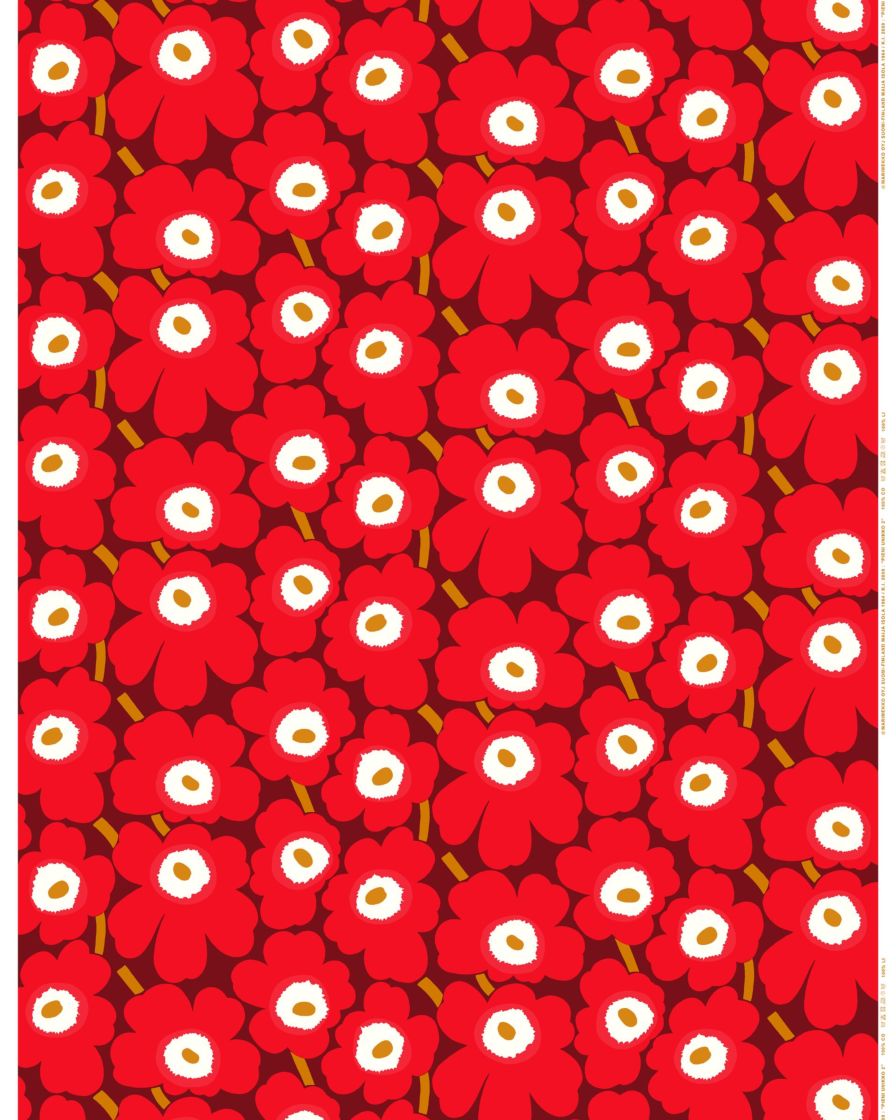
its most iconic of the design is Maija Isola's Unikko (poppy) from 1964.
The first print that stood out to me was the Unikko print. It jumped out of the page at me, it bright bold colours, captured in a repeat pattern of poppies. The contrasting white centres to the poppies jumps out from the print. I was amazed when I realised this busy print was made up of 4 colours. The way the colours has been used gives the illusion there is more happening on the print. The colour palette includes a poppy red and then using a complimentary red tone as a base colour. And then finally using a mustard colour to harmonise with the poppy print.

https://www.marimekko.com/gb_en/printed-fabrics/all-items?p=2
The next print that caught my attention was Marimekko’s print
Siirtolapuutarha. This time there were more colours used, due to the colour palette
used it does not feel as colourful. Using hues of green and blue with black
outlines and whites’ sections make it less striking. The image depicted on the
print is more interesting and detailed. Using flowers again but instead of a repetitive
pattern of the poppies the Siirtolapuutarha print reminds me of a garden. The
pattern is made up of black lines and circles which makes it look very busy.
I find the blue and green tones compliment each other but
the style of the print takes away from the colour qualities. As the black lines
take away from the colours and appear to be laid on top of the colour.
Out of the two my preference is as an image is Siirtolapuutarha
as I find it visually interesting but as a print to use in fashion or furnishing,
I feel as though the Unikko print would be more effective with the repetitive vivid
print creating an eye catching statement piece.
Mary Katrantzou
In her Mary’s designs she uses clashing aesthetics, mixing
technology and craftmanship and magnificent innovative embellishments. Mary
Katrantzou is designs are all about feminine, innovative, fresh and elegant.
Mary Katrantzou spring/summer 2017 collection really stood
out to me. She used the country of her birth for inspiration. Looking at the
history, culture, and mythology. The ancient civilisation of Minoans for her
initial inspiration. The Minoan civilization was a Bronze Age Aegean
civilization on the island of Crete and other Aegean Islands, flourishing from
c. 3000 BC to c. 1450 BC.
Mary Katrantzou was drawn to them
due to their artifacts and culture being heavily dominated by females. This influenced
the feminine body, creating hourglass figure dressed, slender trouser legs with
tunics and peplums to show the curvaceous line of a woman.
Anyway, enough about the style I am here to research the colour
palette that was used. Mary Katrantzou uses traditional ancient Greek colours for
the centre piece depicting an ancient Greek scene using terracotta and black. And
again, a very traditional but contrasting emblem beneath that with another blue
Greek symbol, which I believe to be a Greek god. That was the last part of the
traditional for colour, the designer then uses a very busy square pattern using
black and white as a base square and then accompanied by either a red, green or
blue square. The way the coloured squared are place give feel like an optical illusion,
but the pattern also helps to emphasize the feminine silhouette which is what
the designer was hoping to achieve.

Although it is a busy design with a number of colours in a very varied colour palette, I feel black and white help to balance the of colours causing barrier. I have also observed that not only was the black and white a continuous colour through out the pattern the green was as well. The colour palette is vibrant and playful and the blue reminds me of the sea and the red and green remind me of the streets of Crete as picture below.


Wallace Sewell is a UK based British design studio, it was
established by Harriet Wallace-Jones and Emma Sewell after graduating they from
the Royal College of Art. They a renowned for their scarves, supplying over 400
stockists in 25 countries.
Their pieces are more practical, using colour, structure and yarn and geometric formats. They create individual modern fabrics with bold, blocks and stripes of varying scales. They use traditional techniques their initial design process begins on handlooms. They then mix tradition with state technology, allowing them to weave a variety of qualities from small to larger quantities.
This has been the first designer I could actually see myself purchasing. The first item I came across was a Wallace Sewell’s blanket, the colour lined instantly reminded me of a London underground tube map. Once I clicked into the image, I discovered I was correct as the blanket had been commissioned for the London transport museum. Its funny how certain colours in a different form can still be identified and linked to what they actually are. I loved the bold coloured lines woven across a grey backing making the lines the centre of the piece showing they are the key part of the pattern. I also love the way they cross over representing the underground lines weaving though the different line and interlinking.

Another iconic print that caught my attention was TFL print, living near London and having sat on it many a time I had never paid much attention, let alone known who had designed it. It was interesting to actually have a chance to study the fabric and print. The woven fabric is made up of 4 simple colours, the companies iconic red, dark and light blue, with snippets of beige. The colours cleverly make up iconic London landmarks such as the London Eye, St Paul’s Cathedral, Big Ben and Tower Bridge. Again Wallace Sewell has used iconic colours to relate to the subject.


Ptolemy Mann
Ptolemy Mann is one artist I felt truly inspired by her work
was stunning and experimental. I wanted to find out more about her. Ptolemy
Mann has been creating work from her studio since 1997, creating architectural wall-based
artworks for private, public and corporate clients using hand dyed and woven
technique.
In 2014 Ptolemy established her own retail rug collection in
collaboration with Rugmaker. And in 2005 Ptolemy launched an architectural
colour consulting service. Ptolemy has a unique approach to hand dyeing and
weaving brings her work into the 21st century. Colour theory underpins all of
her work.

No comments:
Post a Comment